
01 — Project Overview
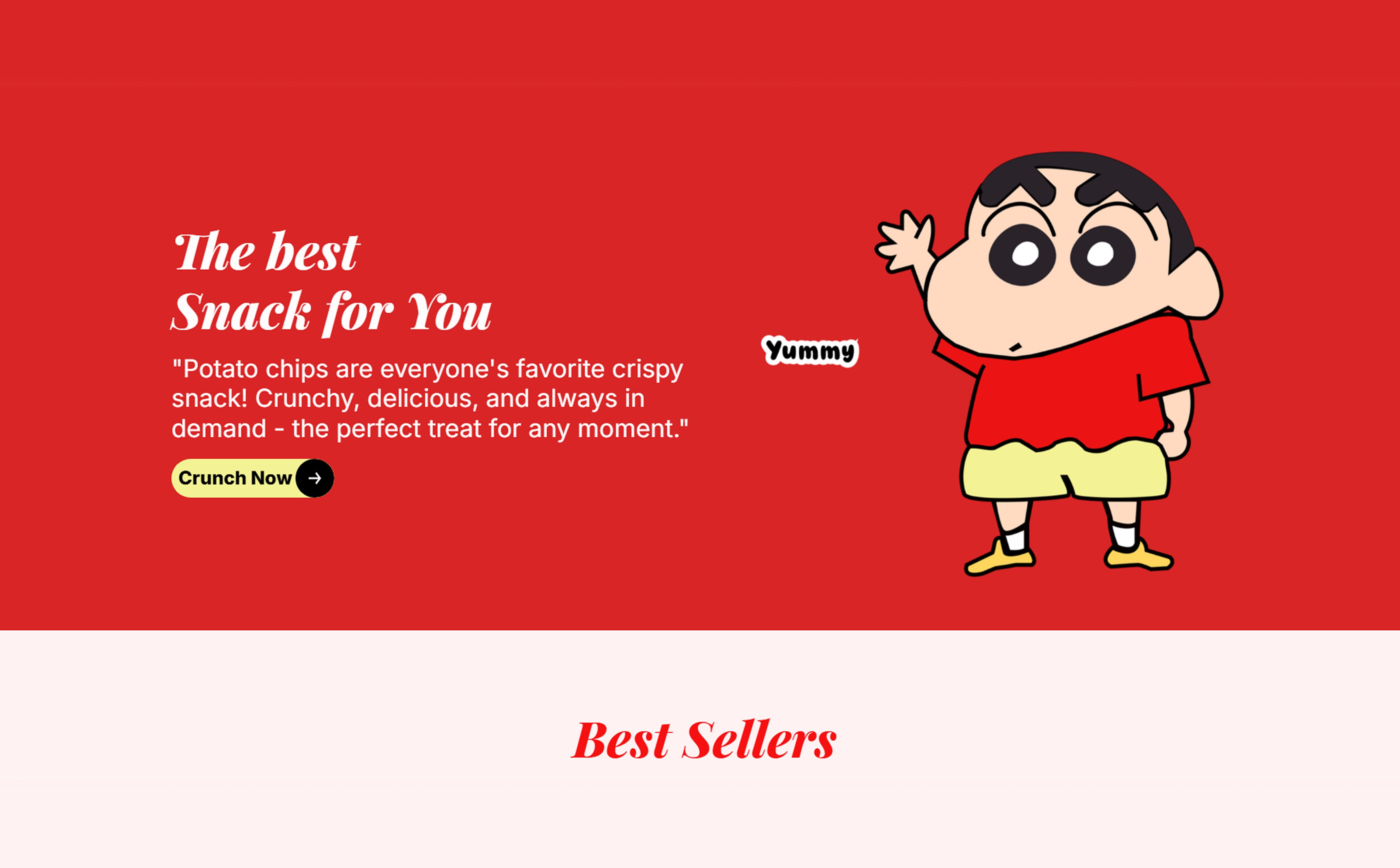
Crunchy lays is a concept landing page designed to showcase a snack brand in a fun, energetic, and premium way.
My goal was to create a modern experience powered by purposeful animations, clear hierarchy, and interactive elements that tell a story as the user scrolls. This project highlights my skills in UI design, UX flow, micro-interactions, animation, copywriting, and Framer development.
02 — Problem
Most landing pages are:
Static
Overloaded with text
Not memorable
Lacking emotional connection
Poorly structured
The challenge was to design a youthful, high-energy, fun experience that feels premium while keeping the flow simple and engaging.
03 — Solution
I built a fully animated landing page that focuses on:
Visual storytelling
Brand personality
Smooth transitions
Purposeful motion design
Clean, premium spacing
Strong product presence
Every animation is designed to guide attention, improve usability, and create delight moments for the user.
Key Features & Highlights
⭐ 1. Purposeful Motion Design
Each section animates with intention:
Hero elements fade and slide in to build anticipation
Flavor's reveal smoothly
Best sellers enter with staggered timing
Cards react to user hover states
CTA buttons have micro-interactions to encourage clicks
The goal: motion that supports the message, not distracts from it.
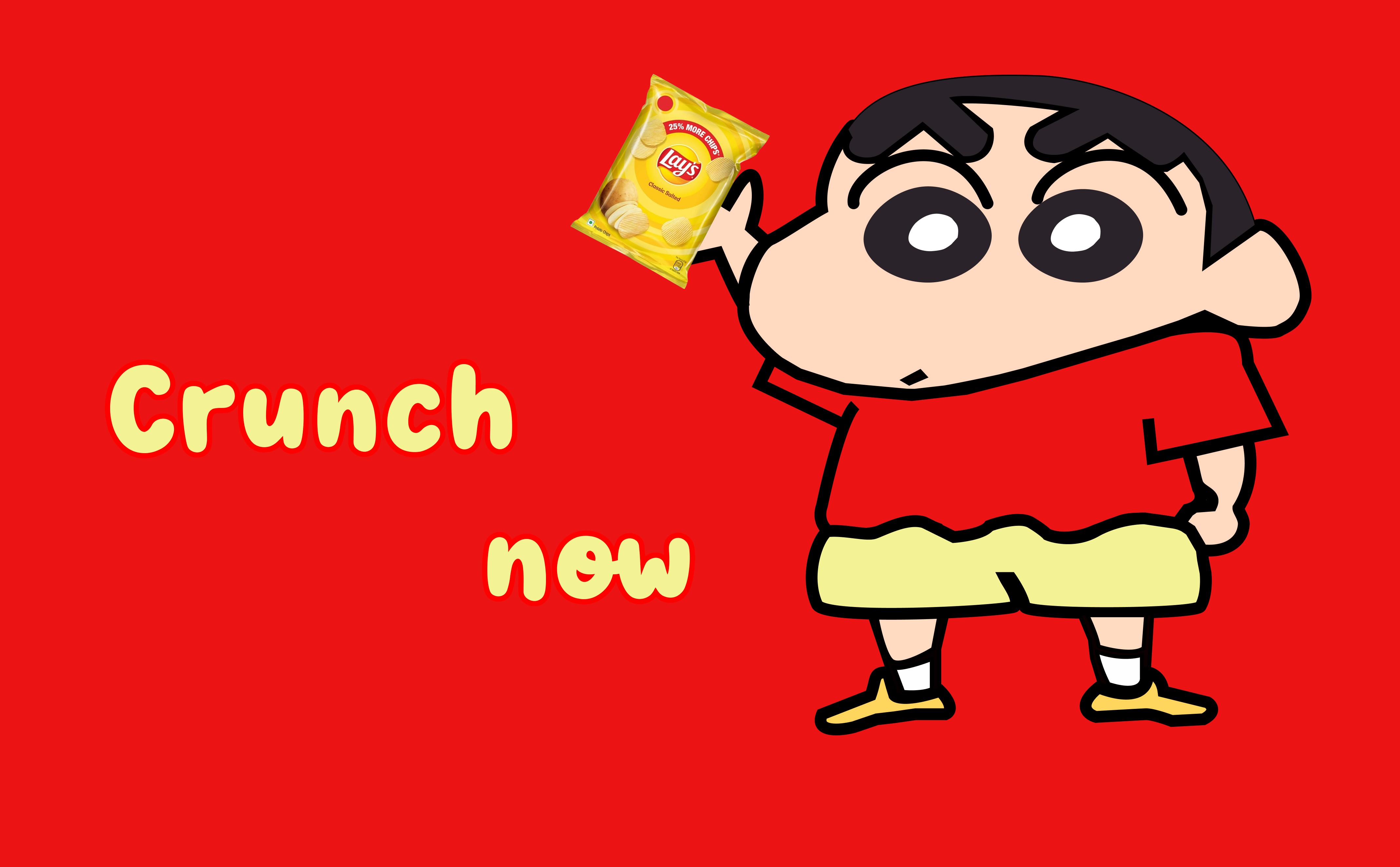
⭐ 2. Chips Burst Hover Animation
One of the most loved interactions is placed near the FAQ section.
When users hover over the Lays packet, chips pop out like an energetic burst.
Why this works
Re-captures attention in a low-engagement section
Reinforces brand personality — fun, crunchy, youthful
Adds a delightful moment that users remember
Communicates freshness + crunch visually
Creates an emotional connection instantly
This single interaction elevates the landing page into a premium experience.
⭐ 3. Clean Visual Hierarchy
I kept the layout fully breathable:
Large hero space
Big visuals
Minimal text
Distinct sections
Clear CTA placement
The user always knows what to read and what to do next.
⭐ 4. Brand-Focused Copywriting
All copy was written by me to reflect:
Playfulness
Freshness
Modern tone
Youth audience
Light humor
Examples:
“Snack. Smile. Repeat.”
“Each chip trains daily for peak crunch performance.”
⭐ 5. Fully Built in Framer
This isn’t just a Figma design — it’s a real, live, interactive product:
Scroll animations
Hover interactions
Component-based structure
Responsive layout
Pixel-perfect spacing
Performance optimized
Real form integration
This demonstrates both design and development skills.
⭐ 6. Design Principles
Playful Precision – Fun animations, but finely tuned
Visual Delight – Create small surprise moments
Zero Clutter – More space = more premium
Natural Motion – Easing, timing, and stagger refined
Brand-first – The chips are always the hero
⭐ 7. Tools Used
Framer (development + animation)
Figma (initial layout structure)
Photoshop/Illustrator (image preparation)


